Fire Launch New Kit: “Validating the Momentum” of the Club
For the second year in a row, the Chicago Fire hosted a launch party to introduce their new kit. Last year, the Return to Red was unveiled in front of an invited crowd of club legends, sponsors and VIPs and selected supporters. This year, the celebration was open to all who wanted to join, hosted at Saturdays Football in Wicker Park.
Although the team had officially unveiled their secondary (“away”) kit for the 2025 and 2026 seasons online earlier in the week, with availability at the team’s Fire Pitch starting on Thursday, the event at Saturday’s Football allowed fans to enjoy festivities including drinks, snacks, DJ sets – and the added sweetener of collaborative merchandise co-branded with Saturdays Football alongside a jersey purchase.
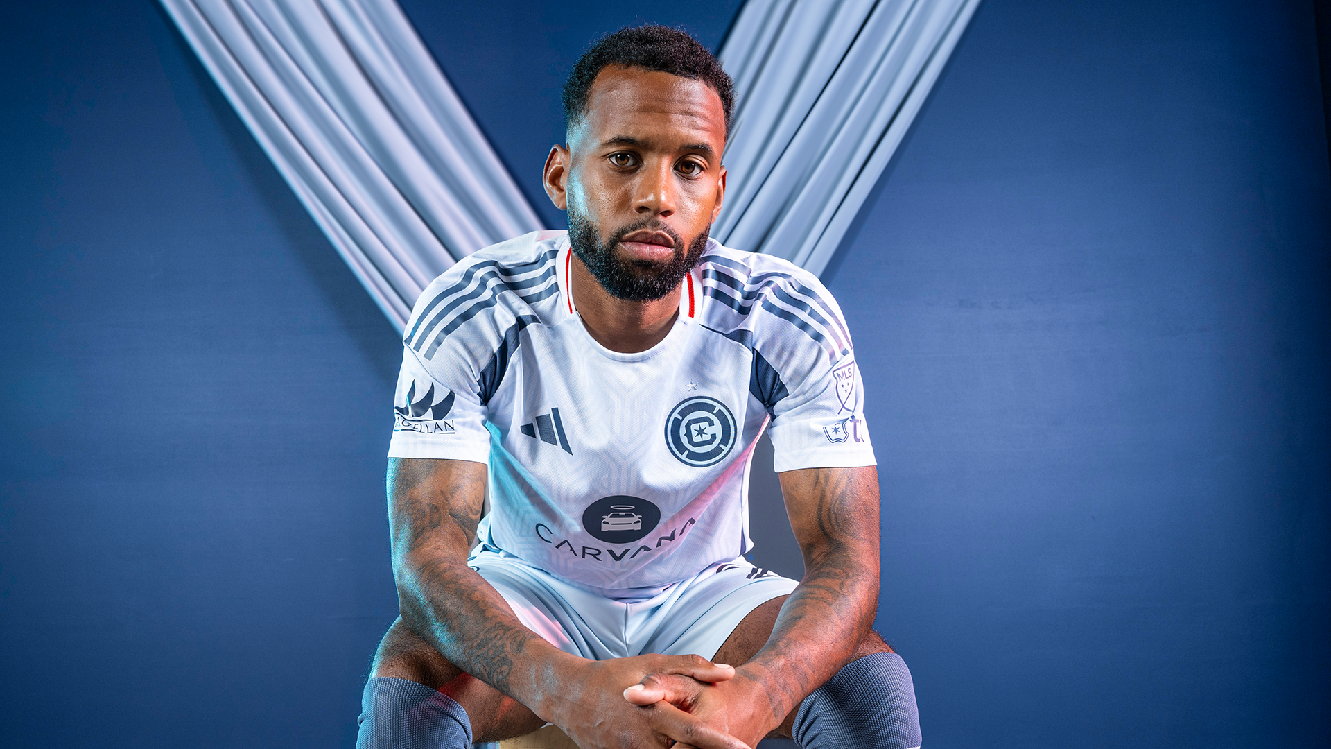
Unlike last year’s Return To Red kit, which featured a design that shared clear design inspiration to the team’s home shirts dating back to their inaugural season in 1998, the so-called Municipal Kit features a new design, though not one that breaks entirely with history. The new design swaps the red of the home kit for blue – something the team first did with its inaugural away jersey – and features a light blue design on a light-colored background – something the team first did with the 2017 away kit.
With a subtle pattern based on Chicago’s Municipal Device in light blue, which the team said “represent the waterways that have become integral to the local landscape and vitality of the city,” and accents in vibrant red, the kit looks subtly – but distinctly – Chicago. Although the Municipal Device is a cherished symbol of the city locally, the Y-shape, which represents the branches of the Chicago River and is a nod to the city’s geography, is not commonly associated with Chicago outside further afield, making the design something of an “insider” nod to Chicagoans.
The overall effect is closest to – but more subtle than – the Lakefront Kit featured in 2021 and 2022, the one outfield jersey that saw use of both the team’s current logo and the short-lived (and much derided) crown logo, which used horizontal lines and subtle gradients with a pattern featuring Chicago’s six-pointed star. “Primary kits are always going to be red moving forward … but the secondary kit on an every-other-year basis gives us the chance to flex a bit and kind of bring some of the city to life,” explained Dan Moriarty, the chief marketing officer for the Fire.
https://twitter.com/meninred97/status/1890826389432963487
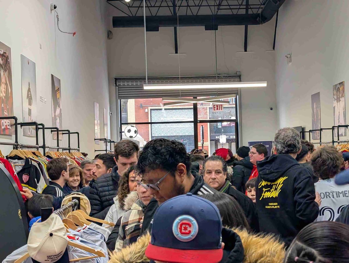
Although the team wasn’t sure kind of crowd would show up – “We had question marks,” Moriarty said, on the expectations for attendance at the event “It’s what, 30, 34 degrees? It’s snowy, you know? It’s a small venue. How many people are going to come out?” Saturdays Football was packed to capacity and a line went down the block, despite the winter temperatures outside on a Valentine’s Day weekend.
“We’ve had a queue of 150 people out here and we’re an hour and fifteen minutes in now,” Moriarty noted. “And the queue’s not getting any smaller. It’s really exciting for us to see the passion that people have.” After the work that the marketing staff and others around the club had put in putting the event together and working with Adidas on the jersey, Moriarty said the launch was “Validating, both for what we’re doing today, but validating for the momentum of the club that we’re seeing more broadly as well.”